Page 423 - Anantmaya Handbook 2020 - 2021
P. 423
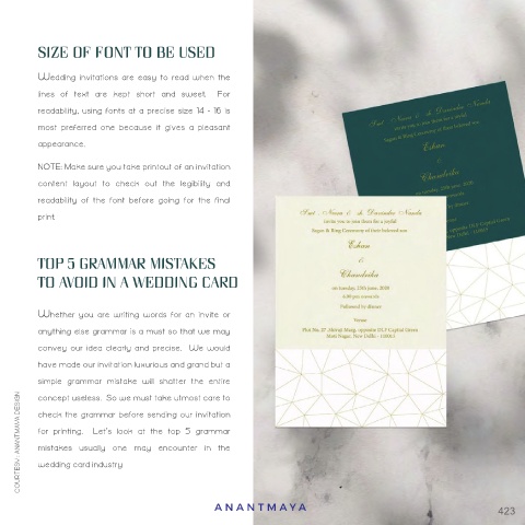
SIZE OF FONT TO BE USED


        Wedding  invitations  are  easy  to  read  when  the
        lines  of  text  are  kept  short  and  sweet.    For
        readability, using fonts at a precise size 14 - 16 is
        most  preferred  one  because  it  gives  a  pleasant
        appearance.
        NOTE: Make sure you take printout of an invitation
        content  layout  to  check  out  the  legibility  and
        readability  of  the  font  before  going  for  the  final
        print.


 FONTS BASED ON EMOTIONS  TOP 5 GRAMMAR MISTAKES

        TO AVOID IN A WEDDING CARD


        Whether  you  are  writing  words  for  an  invite  or
        anything else grammar is a must so that we may
        convey  our  idea  clearly  and  precise.    We  would
        have made our invitation luxurious and grand but a
        simple  grammar  mistake  will  shatter  the  entire
        concept useless.  So we must take utmost care to
     COURTESY : ANANTMAYA DESIGN  check the grammar before sending our invitation

        for  printing.    Let’s  look  at  the  top  5  grammar
        mistakes  usually  one  may  encounter  in  the
        wedding card industry


                                          ANANTMA Y A                                            423

