Page 421 - Anantmaya Handbook 2020 - 2021
P. 421
CHOOSE SIMPLE FONTS

 BUILDING  When  it  comes  to  which  font  to  use,  it  is  your

         choice.  No barriers may stop you and no restriction
         may  befall.  However,  the  fonts  must  be  legible,
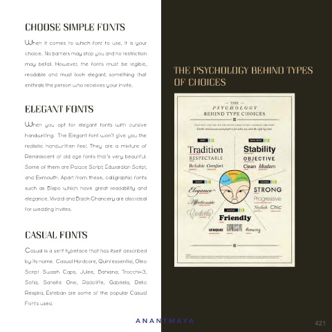
 CONTENT’  readable  and  must  look  elegant,  something  that   THE PSYCHOLOGY BEHIND TYPES
                                                      OF CHOICES
         enthrals the person who receives your invite.


         ELEGANT FONTS

         When  you  opt  for  elegant  fonts  with  cursive
         handwriting.  The Elegant font won’t give you the
         realistic  handwritten  feel.  They  are  a  mixture  of
         Reminiscent of old age fonts that’s very beautiful.
         Some of them are Palace Script, Edwardian Script,
 HOW TO CHOOSE THE FONT   and Exmouth. Apart from these, calligraphic fonts

 STYLE FOR THE INVITATION?  such  as  Bispo  which  have  great  readability  and
         elegance. Vivaldi and Black Chancery are also ideal
         for wedding invites.
 Choosing  the  best  design  and  font  plays  a
 vital  role  in  the  preliminary  design  of  the
 wedding card.  A good font adds beauty to   CASUAL FONTS
 the  invitation and  a  good  Invitation adds
         Casual is a serif typeface that has itself described
 prestige and honour to the personality of the
         by its name.  Casual Hardcore, Quintessential, Oleo
 Host who is giving the invitation.
         Script  Swash  Caps,  Julee,  Bahiana,  Trocchi+3,
         Sofia,  Sansita  One,  Radcliffe,  Gabriela,  Della
         Respira, Esteban are some of the popular Casual
         Fonts used.

                                          ANANTMA Y A                                            421

