Page 239 - Anantmaya Handbook 2020 - 2021
P. 239
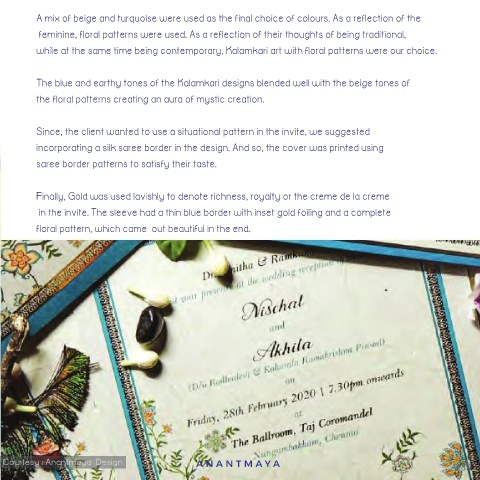
A mix of beige and turquoise were used as the final choice of colours. As a reflection of the
 The colour beige was a natural choice for the bride for the calmness and stillness it imbibed. For the groom,   feminine, floral patterns were used. As a reflection of their thoughts of being traditional,

  we chose turquoise blue for its independence, calmness, masculine, serious and professional attributes  while at the same time being contemporary, Kalamkari art with floral patterns were our choice.
  of his personality.
         The blue and earthy tones of the Kalamkari designs blended well with the beige tones of
 The colour beige was a natural choice for the bride for the calmness and stillness it imbibed. For the groom,
         the floral patterns creating an aura of mystic creation.
 we chose turquoise blue for its independence, calmness, masculine, serious and professional attributes
 of his personality.
         Since, the client wanted to use a situational pattern in the invite, we suggested
         incorporating a silk saree border in the design. And so, the cover was printed using

 Courtesy : Anantmaya  Design  saree border patterns to satisfy their taste.


         Finally, Gold was used lavishly to denote richness, royalty or the creme de la creme
          in the invite. The sleeve had a thin blue border with inset gold foiling and a complete
         floral pattern, which came  out beautiful in the end.


  Courtesy : Anantmaya  Design            ANANTMA Y A                                            239

